message

*** Hello! This blog was written from 2010- 2014, Find me and my current work now at www.LauraBurkhartCreative.com ***

Saturday, October 30, 2010

Art + Interiors: Bold Gestures [Robert Motherwell]

I have spent an absolutely lovely, art-infused weekend in San Francisco getting inspired and rejuvenated. One artist whose work seemed to speak to me the most this weekend was the work of American Abstract Expressionist Robert Motherwell. In Motherwell's work, the act of painting itself is the content of the product. His works were much less about painting "pretty pictures" and more about expressing the raw, unrefined essence of human emotions through the paintings life-size undulating getsures. For me, this kind of art provides a sense of release as it allows the viewer to experience the painting through the lens of their own emotions.
"Art is much less important than life, but what a poor life without it."-Robert Motherwell

Rug via Fort Street Studio, Sofa, chair and lamp via Room and Board, End table via Architonic.com, Vases via Arteriros, pillow via etsy.com/shop/bestillshop, End table via Room and Board, Sideboard via Four Hands 
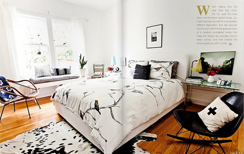
I'm loving the understated black and white palette with touches of yellow where the design strength of each individual piece is enough to carry it. It is a space without clutter or chaos, where you could sit down with a cup of coffee on a quiet morning with a clear head ready to start your day. One designer in particular that does this look well in Victoria Smith of http://www.sfgirlbybay.com/. If you have not yet seen the gorgeous spread in Rue Magazine you simply must check it out. She does mid-century modern with sprinkles of texture and color with expertise and endless style.


Photos via Rue Magazine

Friday, October 29, 2010

Tennis - Marathon

imagining myself on a sailboat off the coast floating up and down with no care in the world and of course with a coke and wine in hand as well. this is just what TENNIS did; a duo from Colorado sailing the open seas just making some fantastic carefree music for us to enjoy. just lay back drink a spritzer and enjoy

signing off ladybird


And a little Etsy inspiration for you as well....

from the etsy shops of (from top left) robinsart, toybreaker, willav, fiori, AmericanGirlinEurope, oefy, SignsofVintage, LittleTypes, jeanbaardsen, kimiko611, fiori

Tuesday, October 26, 2010

I want to live in...John Robshaw's Country Home

 I have long since been a fan of Robshaw's textiles and pillows but after seeing this spread in Lonny I want to move in with him! I love the layering of textures and patterns, the weathered lived-in feel, and the juxtaposition of old and new.

photos via Lonny Magazine

http://www.johnrobshaw.com/
It is so easy to mix his pieces for any color palette. There are just so many beautiful colors and patterns to choose from the challenge really is narrowing it down! Thanks for stopping by, Enjoy!!

Sunday, October 24, 2010

Art + Interiors: Monet and Meditation...

With all the rain we've been having here in California and very little fall,  I've been feeling the world in misty blues, greens and greys. I love the way the rain makes everything around you seemed sort of washed out, it gives you a sense of meditative isolation and with the busy daily grind I've found its important to relish these moments.


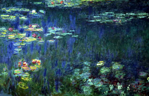
Monet's 'Water Lilies paintings' seemed like a perfect fit for this feeling. The impressionist style focused much more on what the artist felt that they saw rather than what they knew was there and the results were gorgeous paintings full of movement and emotion. The depth created by layer upon layer of paint without much emphasis on precision or detail gives the series their meditative quality, and the deep blues and greens offset by the bright water lilies provides the viewer with hope.
Rug via http://www.jhminassian.com/, chair via Kartell, Pouf via via http://www.shinebysho.com/, chest and end table via Four Hands, chandelier via Marjorie Skouras
The green lucite chair on the deep turquoise vintage rug creates a great juxtaposition of old and new that is evident in Monet's work, especially his later works. He was painting with such experience and rigor and yet opening up the door for the abstract movement of the future. The Moroccan accents under a rich blue chandelier would make this space a perfect little getaway from the hustle and bustle of the everyday. Enjoy!

Also, check out my guest post on the lovely http://www.strataflora.com/!

Friday, October 22, 2010

Deerhunter- He Would Have Laughed (Unofficial Video)


'he would have laughed' on deerhunter's new album is soothing but also a song you can tap your foot to. the video is not wonderful but the song was a perfect fall day song. looking out my window at the yellow red orange and green, this song was the music video for a falling leaf. so put on some boots pile up the leaves and jump!


signing out ladybird
 
 
And a little inspiration ...
From top left, Lonnymag, Lookbook, Josef Albers, Anni Albers, www.etsy/shop/eyeful, Elle Decor, www.etsy/shop/irensuchocki


Tuesday, October 19, 2010

Guest Post: Fluid Tranquility [Destiny Womack]

 Hello there!  It’s Amy from strataflora and I’m so excited and honored to be doing a guest post over here at Love the Daylight!  As a fellow art/design/nature enthusiast, I love Laura’s approach to design – fusing all the worlds together for a unique, rich, cultured look.  I live by the same method, soaking up inspiration from my surroundings, whether it is in the form of art, fashion, nature or people.  There are so many beautiful things to take in and appreciate everyday, and I love sharing them with my readers…and now you!


I came across these gorgeous paintings by artist Destiny Womack and promptly fell in love with the vivid colors and unique marbled look.  The dreamy, flowing textures created by the complex layers of color almost remind me of an oil slick on a rainy day.  Her paintings have a rare duality; they are tranquil yet energetic, static yet fluid…it’s a special quality that really draws you in. 
1.) Rainbow Abalone Mirror – motherofpearl-tiles.co.uk/MotherofPearlCraftItems.aspx 2.) Wegner Wishbone Chair – www.roomandboard.com 3.) Teso Table – http://hivemodern.com  4.) Daum Crystal Peacock Figurine www.neimanmarcus.com 5.) Purple Brick Votive Holder –http://www.neimanmarcus.com 6.) Veli Ceiling Light – www.ylighting.com
7.) Platner Lounge Chair –www.hivemodern.com
Referencing the color palette and dual nature of the paintings plays out very nicely when translated into an interior...I love a combination of sharp, structured pieces mixed in with soft edges, and a variety of textures. The translucent furniture and accessories make a statement, but don’t compete with other elements. Reflective surfaces, like a high-gloss finish or metallic varnish brighten and expand the room (like this attention grabbing abalone shell mirror!)


I hope you enjoyed my little guest post…to find more from me, stop by www.strataflora.com. Have a lovely day!

I heart Sacramento; NeoCrocker

This weekend I was able to attend the last of the Crocker Art Museum's fabulous events to celebrate the Neo Crocker. The art museum went through an extensive transformation and my lovely Aunt Linda Farley was there the whole way as one of the Museum's Directors. The Museum is absolutely gorgeous, if you are any where even near the area you simpy MUST check this out! You'll find Historical Californian art, a large and exquisite pottery collection, modern and contemperary works large and small, and SO much more. The event did not dissapoint either. With neon lights, fire dancers, a dance floor surrounded by art and endless ways to be in on the creativity I was in absolute heaven!
I shared only a few of my faves here from the abstract to the aboriginal works to Sacramento natives, there were just too many to choose from! You'll have to check out the Museum yourself to really soak in all the inspiration. And expect plenty of future posts featuring the wide range of talents exhibited! Enjoy! 

Friday, October 15, 2010

Art + Interiors: Polished Vintage...

I stumbled upon this gorgeous photography while perusing Etsy and I just fell in love. I love the weathered, golden, vintage feel to them. They emit warm, relaxation with a healthy sense of wonder. I feel like I could just hop on that Vespa and ride on through the sunset without a care in the world.
www.etsy.com/shop/elgarboart


Live in it...
Sculpture via Ateriors. rug via West Elm. Chair via Rogan. Daybed via Oly. Pendant via Arteriors. End table via West Elm. Mirror via Arteriors
And I have to say, there is something to the mix of black, brown and gold that I absolutely adore. Whether in attire or interior, the palette reads indie chic that can be easily polished with a little addition of chrome to pull the whole thing together. I love this look for a down-to-earth sophisticate who hasn't lost their sense of adventure. Mix in a few personal souvenirs and you've got a warm and polished place to call home. Enjoy!

Thursday, October 14, 2010

The Hundred In The Hands - Tom Tom (This Desert EP out now)


my debut song...this was a hard choice, how do i want people to view me; i pondered this over for hours, then i though screw it! i picked this song b/c i just like it and thats what i will do most days. some are to display a feeling i am having that day but most are just gonna be that simple. i like it. anyway back to the video-the outfits are awesome, aside from the guy in the white jeans but hopefully it was before labor day at least. alright so the deal is i would love your feedback please, this is to be a dialog more than me just putting songs up for you to steal my music, jk ok well thats all i have for the day of oct. 14 2010. hope you enjoy it!     signing off ladybird


Tuesday, October 12, 2010

Art + Interiors: Thinking outside the body [Yves Klein]

Millions can learn to draw and paint, but those that are remembered for decades and decades are those who take risks and think outside of the box, who think conceptually and value the artistic process as much as the end result. It is always encouraging to me to study such artists, it is a reminder to continue to pursue what I believe in and a shot in the arm for my own creativity. Yves Klein is one of these artists.

For Klein, the color blue embodied the freedom of the sky. In 1960 he raised eyebrows with his 'Living Brush' series. Nude models would apply blue paint to their bodies and to the sound of a single note being played by an orchestra and under Klein's instruction, would transfer the paint to the canvas stretched across the floor. Though more than a little quirky, Klein's work represents the fusion of conceptual and performance art with stunning end results.
There is so much energy in these pieces and the thick, saturated blue adds depth that just pulls you in.
Live in it...

http://www.abchome.com/
I couldn't resist these multi-faceted end tables. Whether you choose one color or spring for all three, it is a great way to add interest and depth, I love the way they reflect the light like oversized diamonds. They're an instant modern twist with a futuristic edge. Enjoy!

Sunday, October 10, 2010

Art + Interiors: Welcoming Fall [Jan Groenhart]

I'm spending the weekend in Seattle and it finally feels like fall. The leaves are starting to change in brilliant shades of red, orange and yellow, the air is brisk and wet, and every coffee shop is full with people huddled over hot cups of joe. I love fall, I've loved all the warm conversations with my closest friends over lots of coffee surrounded by so much love, and I absolutely love these paintings by artist Jan Groenhart...
www.jangroenhart.com
I love the faintest hint of a landscape amidst the rich colors and textures, the way they seem to embody fall without the depiction of leaves at all. I can't take my eyes off the glowing persimmon foreground in the second piece, and again I'm inspired to conceptualize an interior with these same qualities...

Live in it...
lamp via http://www.woodbamboodecor.blogspot.com/. garden stool via http://www.target.com/. end table http://www.arteriorshome.com/. pillows via www.etsy.com/shop/ginette1223. end table via West Elm . coffee table via Four Hands. pillow via cb2. chair and pouf via ikea. End table West Elm.

Get the feeling of fall by mixing reclaimed, unfinished wood pieces with painterly fall brights. I also love mixing an arrangement of end tables that reference each other in shape while remaining organic and light hearted. The grey chair reminds me of a cozy fall coat while the bamboo pendant would bring in loads of warmth on an otherwise gloomy day. I would snuggle up with a hot cup of tea and a good book for an afternoon of rejuvenation in this fall inspired space. Enjoy!

Thursday, October 7, 2010

Art + Interiors: An oldie but a goodie [Van Gogh + Kelly Wearstler]

It is hard to deny the influence that Van Gogh has had on the art world. He was not afraid of color, he was not afraid to paint what he saw rather than what he knew to be accurate, and most importantly for artists for years and years to come, he developed a style that was all his own.
I love the energy in his work. The fiercely bright colors in constant motion create an atmosphere that is both vibrant and alive.
Live in it...

There is one Interior Designer that for me possesses many of the same qualities as Van Gogh's work, the one and only, Kelly Wearstler. Much like Van Gogh, she has boldly developed a style that is all her own. She has paved the way for designers to use vivid colors, play with scale and contrast, and let their personality be expressed through a space. She also happens to decorate with as many shades of turquoise as Van Gogh painted with...


photos via http://www.kwid.com/
Greens, blues and yellows tend to be the palette of colors I live in so I would post up in these spaces any day. Though I've never been lucky enough to be in one, Wearstler's spaces seem to just envelope you in a work of art, and for me, that is what its all about. Enjoy!

Monday, October 4, 2010

Art + Interiors: The emergence of beauty...

"Old as I am I continue to be amazed at the sudden emergence of daffodils and stories."
- Ernest Hemmingway
I stumbled upon this gorgeous photography by artist Maleah Matthews and I just had to do a post on it. I love the slightly blurred images drenched in sunshine and stillness. They remind me to take a moment to just breath and notice the world around me. As much tragedy and heartbreak there is in the world things continue to bloom, dreams continue to come true, and people continue to love. Check out Maleah's website for more gorgeous works of art. http://www.maleahmatthews.com/ 

Live in it...
from top left..wallpapers via http://www.wallpapercollective.com/. bed via http://www.anthropologie.com/. sideboard via http://www.fourhands.com/. paint via Benjamin Moore. rug via http://www.ochrestore.com/. end table and chandelier via http://www.arteriorshome.com/.

I love the subtle, delicate hues from Maleah's work, these pieces prove there is a way to bring pastels to a space without referencing the baby's room. This well-traveled look with a floral touch is sure to make you feel light and airy the moment you step into the room, enjoy!

Sunday, October 3, 2010

Oh Happy Day

A sunny installation at the SFMOMA to help me say have a bright and joyous Sunday! And come back for more as I'll be keeping you inspired with artists old and new and design to make you swoon! And don't forget to click follow on your right side of the browser to show your support and always be in the loop. Thanks for visiting today I hope you're loving life and living well!

Saturday, October 2, 2010

Art + Interiors: Textile Luxury...

Often in life we have to learn from the past to be able to look forward. ,In the same way, a lot can be taken from traditional art forms as well and given a fresh look they can be breathtaking. This tradition Indian Karuppur textile does just that. The brilliance of  the rich red dye the golden thread gives a feeling of decadence to an organic form. And it is quite fitting as the textiles were often gifted as dresses of honor in the late eighteenth century. Even more inspiring is the hand work that went into each stitch of a piece like this, undergoing a meticulous process of weaving and dying. The result is something so delicately stunning, I'm in love...

Live in it...


I love the idea of fusing a look of well traveled tradition with modern glamour and these pieces do just that. The Karuppur textile makes me want to put a modern golden end table atop a traditionally woven rug. And with the most powerful colors surrounding you how could you not feel like
 nobility? Enjoy!


Friday, October 1, 2010

Adler Inspiration...

Last night I was lucky enough to attend the official opening of Jonathan Adler's new store in Fashion Island. The event was fabulous, the store is gorgeous and the space was absolutely brimming with inspiration. From the turquoise walls to the quirky sculptures to the fashionable guests it was definitely a night to remember...


I had the chance to snap a photo with the man behind it all with the lovely and inspiring Sabina Vavra of http://www.sabinavavra.com/ whom I've had the pleasure to work for these past 5 months...

And I cannot help but love someone who stays true to their art...


I loved the brilliant colors in poppy prints and patterns juxtaposed against the metallic accents and white on white.

 We also enjoyed the company of fellow designers, Julie of http://www.bellemaison23.com/ and Rick Campos of http://www.christophertracyinteriors.com/. I left feeling uplifted and inspired, Adler's designs leaving me with a sunnier outlook on life. http://www.jonathanadler.com/ enjoy!